
Nowadays we spend most of our time in front of our computers or laptops. We use them for everything, starting from work up to watching TV shows and following our budget. The programs you use depend on the things you need, but there is one thing each and every one of us uses on a weekly basis. We are talking about the charts!
No matter if you use them to follow the money you are earning or spending or if you need to make an important presentation at your job, chances are you use at least a few types of charts. Most people have heard about one type or another, but did you know that there are so many different types of charts?
To help you choose the best type for your task and to help you finish your job easier, we are going to tell you more about the types of charts and their uses. Follow this guide the next time you have an important task and you will realize you can finish it a lot faster and you will be amazed by your skills.
1. Pie
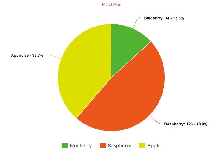
As the name suggests, these charts look like a pie and they are used to show how the whole is broken into different parts.
Unlike bar charts, they show dependent data, and people in sales are the ones who use this type of chart most frequently. It is easy to see any information in this chart and you can easily compare the size of the parts.
2. Bar
This is the most common type and is one that is mostly used. As you probably know, the values and length of the bar depend on the measured group or numbers. They can be horizontal or vertical. The vertical ones are also called column charts.
Vertical ones are more commonly used, but horizontal ones are a better option when you have to show a lot of bars and you don’t have enough space.
3. Line

Have you ever seen the charts the brokers use? Well, they are called line charts. This type is most commonly used to show measurements made over time.
They show lines that are moving up and down, and with that, they show positive or negative changes. They are also used to predict outcomes and many companies prefer them over other types of charts.
4. Area
The area chart is based on the line charts. However, the concept of the bar charts is used here as well, because there are colors and shading between the zero baselines and the line.
When people use this type of chart, they usually combine it with the stacked bar so that they can easily see the changes in the values, but also are able to notice the changes in the contributions.
5. Flowcharts
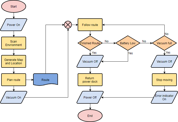
These charts are used to show the workflow or any type of tasks the employees have. They look like small boxes and there are usually arrows that show the connection between the boxes.
People usually add different colors to each segment, so it is easier to compare the tasks or to see any differences or similarities.
When creating these carts, it is recommended to use a program that will make it easier for you to create them. Zen Flowchart suggests that creating and styling the charts with only one click makes the job a lot faster and easier.
6. Scatter plot
The way this chart works is that it shows the numbers by using points. Those points are put on the two axes. This plot is commonly used to show the relationship between those numbers.
The scatter plots are usually used to identify and show values by making a comparison between the numbers. Basically, you can compare the numbers and see if there are any gaps in the cart. You can also see if the connection between is strong or not and you can notice if the numbers are going up or down.
7. Box plot
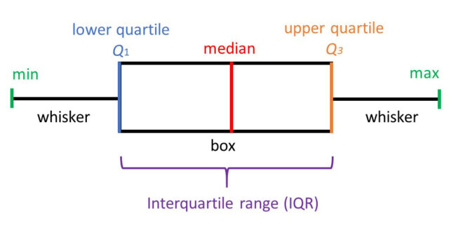
As the name suggests, this plot uses boxes and lines to show the values of the measured numbers or groups. Their position shows the places where most of the numbers are piled.
People use the box plot chart when they need to compare groups. However, if you need more details and if you want to show the rise or the fall of the numbers for each group individually, then it is better to use another type of chart.
8. Dot plot
This plot is really similar to the bar chart, as it shows the numbers for different groups. However, the dot plot shows the position and not the length.
These plots are great when you need to do comparations and the baseline is not really needed. Imagine them as line charts, but without the lines.
9. Stacked bar
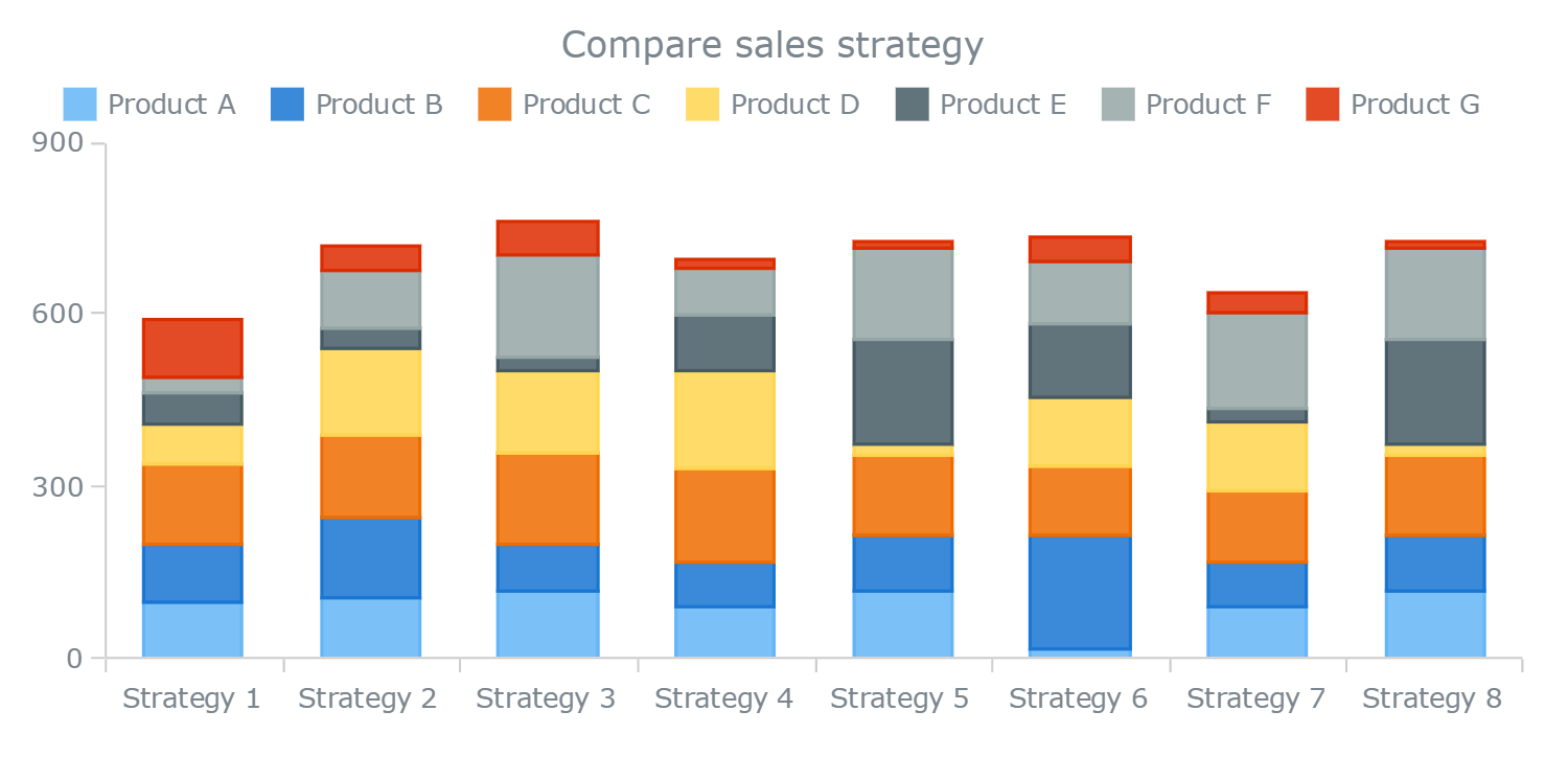
A stacked bar chart is a variation of the bar chart. When you need to divide the bars into smaller sections so that you can look at more precise data, you can use the stacked bar.
This way you can easily compare numbers and you can show the similarities or the differences between two or more measured groups.
10. Histogram
This is also a variation of the bar chart. When there are a lot of vertical values, you can push them together and get a histogram. However, if the vertical value is not counting the frequency, then experts recommend using the line chart instead of the bar chart.
11. Bubble
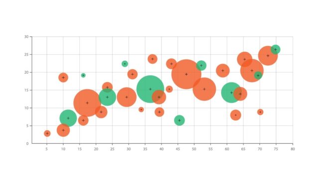
If you have three values and you want to show the relationship between them, you can use this variation of the scatter plot. People usually use different colors and sizes of the bubbles, so that the chart looks better and the values are easier to recognize.
Sometimes, you can connect the bubbles with a line so that you can see the sequence of the values.
Have you ever used any of these charts? If you want to follow the tasks of your employees, then you should use a flowchart, however, if you want to be able to predict your sales and increase or decrease in numbers then you should choose the line chart.
Depending on the task you have, you can choose one of these types and make sure that the job is done correctly. Experts recommend making them as clean, and as simple as possible so anyone can understand what you mean without having to spend too much time.


