So many hinges on a logo: a simple mistake can alter the entire meaning of your image and make you a joke. These eleven examples all failed on some level.
We know it’s not easy designing a logo, but these are inexcusable.
11Kid’s Exchange

A space (or lack of a space) can make all the difference in your logo. You can deduce what the business actually does pretty easily, sure, but that first impression is important and will never, ever go away, much like the mistake which led to it.
10Brazilian Institute for Oriental Studies

The amount of detail used in a design can greatly affect how the image is read. Minimalist symbols force the viewer’s mind to do all the work, and sometimes our minds go to… places. Strange, strange, places. It’s supposed to be a pagoda in front of a sun, but,well, you get it.
9Dough Boys

It’s hard to deny that this logo looks like, well, yeah. It’s easy to see how this happened: the designer simply threw the initials together and was pleased with the symmetry. If that’s true then it’s understandable how this faux-pas continues to happen, sometimes with different letters.
8Locum

This one’s only bad after breaking through some language barriers. Locum is a Swedish real-estate group. English readers seeing this logo will think something else, though. A capital L, or maybe not swapping the O with a heart, could have saved this one some embarrassment.
72012 Olympics Logo
This one, more than any other, is like an ink-blot test: does it look like a swastika? Lisa Simpson performing an s*x act? The word ‘Zion’? All three have been thrown out there, but regardless of what you see, one thing is perfectly clear: it’s uglier than sin.
6Chief Wahoo

It’s easy to point out racist caricatures in older logos, but the thing about Cleveland’s baseball logo/mascot is that it’s survived into modern-day with few redesigns. The controversy surrounding Chief Wahoo continues to this day.
5Hilary 2016
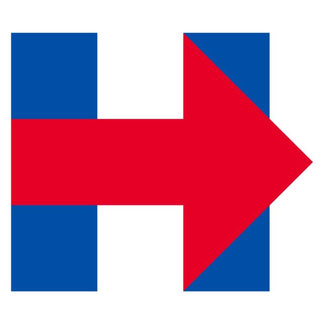
Minimalism can be a powerful thing but go too simple and one detail that seems askew will make viewers question the whole thing. A simple H is fine, but what is the red arrow supposed to mean? Political logos are usually boring as it is, but inexplicable can be just as bad.
4World Cup Brazil
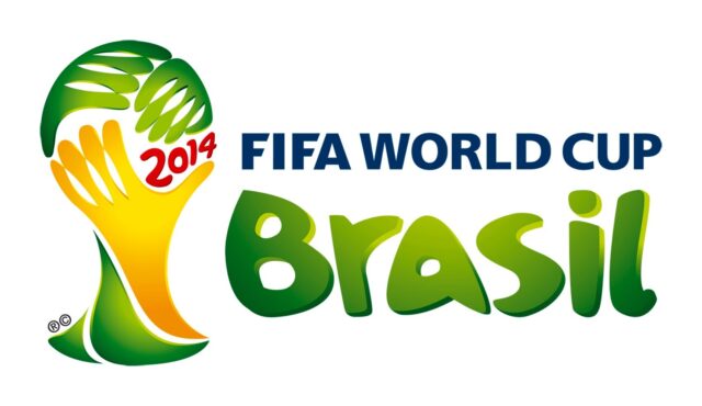
Once again minimalism takes its toll. A hand slapping (or grasping?) a soccer ball becomes a facepalm when you leave the front of the ball blank. Though minor in comparison to the other entries on the list, the internet had fun when this one was revealed.
3Megaflicks
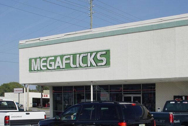
Once again we see how much punctuation and font can change everything. If you look at this video store’s logo close enough you can see a small separation between the A and F, but from a difference (or at a glance) you’re bound to misread this.
2The Red Sox
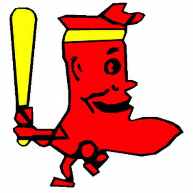
It’s hard to say that modern sports logos are truly bad, so let’s travel back to the 1950s and dig one up. This is the Red Sox logo of the time, depicting an actual red sock playing baseball. Between the color choices and the sock’s design itself, yikes. Just yikes.
1Denver Nuggets
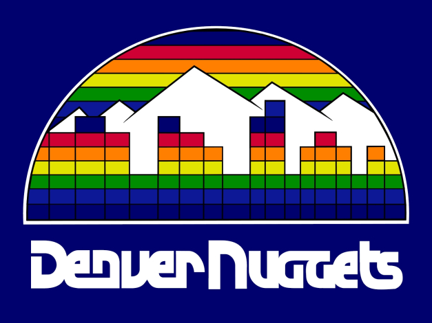
This was the NBA team’s logo from 1982 to 1993. Utilizing rainbows in a design is a brave but often foolish choice, and this is no exception. Between all the sharp angles and thick black lines creating a grid, this looks like something an Atari 2600 would spit out.


